Hidden meaning of corporate logos This
logo doesn’t seem to hide much at first sight, but it gives you a
little insight in the philosophy behind the brand. First of all, the
yellow swoosh looks like a smile: Amazon.com want to have the best
customer satisfaction. The swoosh also connects the letters a and z,
meaning that this store has everything from a to z.
This
logo doesn’t seem to hide much at first sight, but it gives you a
little insight in the philosophy behind the brand. First of all, the
yellow swoosh looks like a smile: Amazon.com want to have the best
customer satisfaction. The swoosh also connects the letters a and z,
meaning that this store has everything from a to z.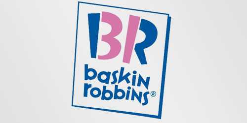 The old logo of Baskin Robbins had the number 31 with an arc above it.
The new logo took this idea to the next level. The pink parts of the BR
still form the number 31, a reference to the 31 flavours.
The old logo of Baskin Robbins had the number 31 with an arc above it.
The new logo took this idea to the next level. The pink parts of the BR
still form the number 31, a reference to the 31 flavours. 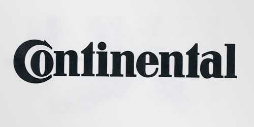 Continental
is a manufacturer of tyres.You could actually see this in their logo,
because the first two letters create a 3-dimensional tyre.
Continental
is a manufacturer of tyres.You could actually see this in their logo,
because the first two letters create a 3-dimensional tyre. 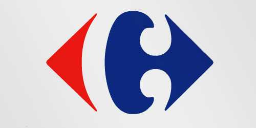 Carrefour
is one of thebiggest European retailers, and it’s also French for
“crossroads”. The logo symbolizes this word via two opposite arrows.
They also added the first letter of the name, because if you look
closely you’llsee the letter C in the negative space between the two
arrows.
Carrefour
is one of thebiggest European retailers, and it’s also French for
“crossroads”. The logo symbolizes this word via two opposite arrows.
They also added the first letter of the name, because if you look
closely you’llsee the letter C in the negative space between the two
arrows. 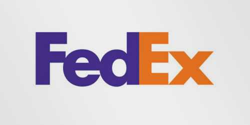 This
is probably one ofthe best known logos with a hidden meaning.If you
look closely, you’ll see an arrow that’s formed by the letters E and x.
This arrow symbolizes speed and precision, two major selling points of
this company.
This
is probably one ofthe best known logos with a hidden meaning.If you
look closely, you’ll see an arrow that’s formed by the letters E and x.
This arrow symbolizes speed and precision, two major selling points of
this company.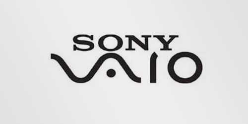 Sony
Vaio is a well known brand of laptops. But did you know that the name
Vaio logo also had a hidden meaning? Well, the first two letters
represent the basic analogue signal. The last two letters look like a 1
and 0, representing the digitalsignal.
Sony
Vaio is a well known brand of laptops. But did you know that the name
Vaio logo also had a hidden meaning? Well, the first two letters
represent the basic analogue signal. The last two letters look like a 1
and 0, representing the digitalsignal. 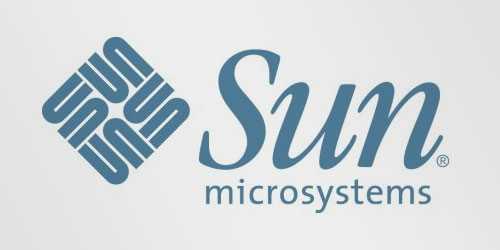 The
Sun logo is one of the most famous ambigrams in the world. You can read
thebrand name in every direction; both horizontally and vertically.
This logo was designed by professor Vaughan Pratt of the Stanford
University.
The
Sun logo is one of the most famous ambigrams in the world. You can read
thebrand name in every direction; both horizontally and vertically.
This logo was designed by professor Vaughan Pratt of the Stanford
University. 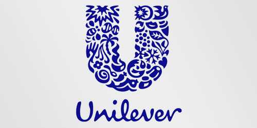 Unilever
is one of the biggest producers of food, beverages, cleaning agents and
personal care products.They produce a huge amount of different products
and they wanted to reflect this in their logo. Each part of the logo
has a meaning. For example: the heart represents love , care and health –
feeling good, a bird is a symbol of freedom. Relief from daily chores–
getting more out of life .
Unilever
is one of the biggest producers of food, beverages, cleaning agents and
personal care products.They produce a huge amount of different products
and they wanted to reflect this in their logo. Each part of the logo
has a meaning. For example: the heart represents love , care and health –
feeling good, a bird is a symbol of freedom. Relief from daily chores–
getting more out of life . 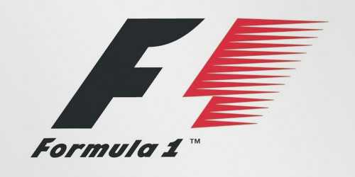 At
first, this logo might not make much sense. But if you look closely,
you’ll see the number 1 in the negative space between the F and thered
stripes. I also love how this logo communicates a feeling of speed.
At
first, this logo might not make much sense. But if you look closely,
you’ll see the number 1 in the negative space between the F and thered
stripes. I also love how this logo communicates a feeling of speed. 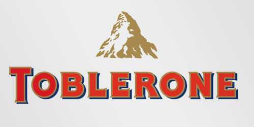 Toblerone
is a chocolate-company from Bern, Switzerland. Bern is sometimes called
‘The City Of Bears’. They have incorporated this idea in the Toblerone
logo, because if you look closely, you’ll see the silhouette of a bear.
Toblerone
is a chocolate-company from Bern, Switzerland. Bern is sometimes called
‘The City Of Bears’. They have incorporated this idea in the Toblerone
logo, because if you look closely, you’ll see the silhouette of a bear.

click on link to the post
This
logo doesn’t seem to hide much at first sight, but it gives you a
little insight in the philosophy behind the brand. First of all, the
yellow swoosh looks like a smile: Amazon.com want to have the best
customer satisfaction. The swoosh also connects the letters a and z,
meaning that this store has everything from a to z.
The old logo of Baskin Robbins had the number 31 with an arc above it.
The new logo took this idea to the next level. The pink parts of the BR
still form the number 31, a reference to the 31 flavours. Continental
is a manufacturer of tyres.You could actually see this in their logo,
because the first two letters create a 3-dimensional tyre. Carrefour
is one of thebiggest European retailers, and it’s also French for
“crossroads”. The logo symbolizes this word via two opposite arrows.
They also added the first letter of the name, because if you look
closely you’llsee the letter C in the negative space between the two
arrows. This
is probably one ofthe best known logos with a hidden meaning.If you
look closely, you’ll see an arrow that’s formed by the letters E and x.
This arrow symbolizes speed and precision, two major selling points of
this company.Sony
Vaio is a well known brand of laptops. But did you know that the name
Vaio logo also had a hidden meaning? Well, the first two letters
represent the basic analogue signal. The last two letters look like a 1
and 0, representing the digitalsignal. The
Sun logo is one of the most famous ambigrams in the world. You can read
thebrand name in every direction; both horizontally and vertically.
This logo was designed by professor Vaughan Pratt of the Stanford
University. Unilever
is one of the biggest producers of food, beverages, cleaning agents and
personal care products.They produce a huge amount of different products
and they wanted to reflect this in their logo. Each part of the logo
has a meaning. For example: the heart represents love , care and health –
feeling good, a bird is a symbol of freedom. Relief from daily chores–
getting more out of life . At
first, this logo might not make much sense. But if you look closely,
you’ll see the number 1 in the negative space between the F and thered
stripes. I also love how this logo communicates a feeling of speed. Toblerone
is a chocolate-company from Bern, Switzerland. Bern is sometimes called
‘The City Of Bears’. They have incorporated this idea in the Toblerone
logo, because if you look closely, you’ll see the silhouette of a bear.click on link to the post


